

Telehealth Patient Portal
Be on your way to feeling better

OVERVIEW
Client is a Telehealth provider of online and on-demand healthcare delivery services and software. Patients can login to an online portal and schedule video or phone consultations with board certified doctors, therapists, psychiatrists and dermatologists.
PROBLEM
The existing patient portal was not able to deliver the user needs. The low engagement, high drop off rates combined with a confusing interface needed a complete facelift.
DESIGN CHALLENGE
To create a personalized, simple, and easy-to-use patient portal that guides users down a quick, clear path; making them feel taken care of, at ease, and empowered to manage their medical issues virtually.
GOALS
Improve patient satisfaction by increasing Net Promoter Score (NPS).
Reduce cost by decreasing customer service calls.
Decrease time taken to schedule a consultation.
MY ROLE
Research, Ideation,
Interaction Design,
Prototyping and User testing
TEAM
UX Designer(Me)
Visual Designer
Product Manager
TIMELINE
4 Months
UNDERSTANDING THE PROBLEM
Telehealth aims to provide patients a quick and easy access to healthcare for non-emergency conditions. It prevents having to visit the doctors office and wait hours before you see a doctor.
Users are already in an uneasy state and each extra screen adds to the frustration. On the other hand, providers need adequate information necessary for the right diagnosis and treatment plan.
The ultimate goal is to have a seamless experience that focuses on intaking all the required information and quickly connecting patients with doctors.

INITIAL RESEARCH
Observe and Listen
I started by shadowing customer support agents and identifying the top customer complaints listening to their conversations with the users.
Survey
I used Surveygizmo to create survey panels for different types of patients. The three types of users were Medical patients, Behavioral Health patients and Dermatology patients. We received 18,209 responses for this survey.
User Frustrations
Wrong expectations.
Process was tedious, took a long time to connect to a doctor.
Issue with Provider.

Interviews
I interviewed 5 power users to understand their pain points. Power users were patients who had more than 3 consultations in a year.
User quotes from the interviews
“The doctor told me I had an upper respiratory infection. But my symptoms don’t resemble it. Did not receive any prescription for any medication either.”
“The scheduling process was long and tedious and I gave up on the pharmacy page.”
Target Audience Demographics
Age Group Distribution
Gender
PERSONAS
After analyzing the surveys results and interview notes, I spent some time digging in Google Analytics to get some more insights about the users.
The ‘Audience’ and ‘Behavior’ section in Google analytics reveals some really useful informations about the users. After analyzing the demographics, device preferences, interests, affinity categories we created the user personas.

6 out of 10 users were dropping off from the home page.

JOURNEY MAPPING

Already frustrated user
2 times a year is the average a user gets sick and needs the service. Unlike regular ecommerce customers, our users are not feeling good when they are purchasing the service. They are already frustrated with their or their children’s health condition and have very low ‘design‘ tolerance. In such cases, the room for ‘experience issues’ becomes minimal.
COMPETITIVE RESEARCH


To better understand, I explored how other Telehealth companies are approaching the problem. To deep dive in their the user experience I created accounts on Teladoc, Amwell and Doctor on Demand and went through a video consultation pretending to be sick. Click here to read the detailed experience report.
IDEATION
I took sometime to lead a workshop and share our findings with the team to sketch out some ideas.
I shared the initial ideas with the stakeholders and developers to get some early feedback.


EARLY SKETCHES
We figured that the primary task the user would do from the home screen is seeing a provider as soon as possible.
The design focus from the beginning was to keep it simple and work around the primary action of connecting with a provider.
USERFLOW
The balancing act
The providers required detailed patient information and on the other hand patients wanted to fill in minimal information and complete the process as soon as possible. Maintaining the balance and keeping both user groups happy was the key to this project.

FEATURES
Simplified Registration
One step at a time.
We noticed a lot of users dropping off during registration. The current design had an overwhelming 14 input fields in one page to register for the service.
Due to medical constraints and legal requirements we couldn’t remove any of those fields. We decided to tackle this problem in phases.
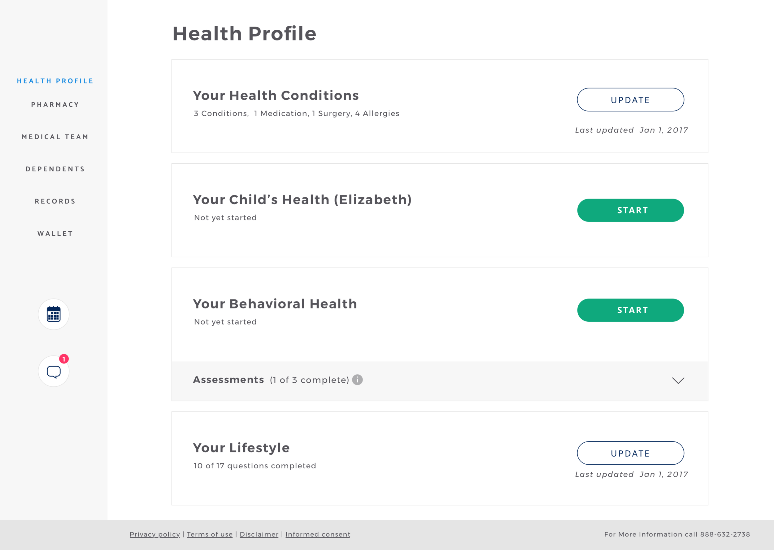
Phase one, we split the registration into 3 steps keeping all the required fields. Phase two was allowing users to create an account with username, password, email and DOB. Once they fill out this basic information, we progressively profile them inside the portal.


Setting the right expectations
What the heck is Telehealth?
Telehealth is relatively new to consumers in general. Less than 3% of U.S population used Telehealth services in 2017.
Majority of people have no idea how can Telehealth can help them. Users asked prescriptions for sleeping pills, Adderall, medical marijuana etc. Telehealth rules and regulations allow doctors to treat only a specific set of conditions and prescribe non-narcotic medications.
The challenge was to set the right user expectations of what they can and cannot expect from the visit.
We experimented with different designs and added the content at different stages of the experience. AB testing our beta releases using Optimizely guided our design decisions.
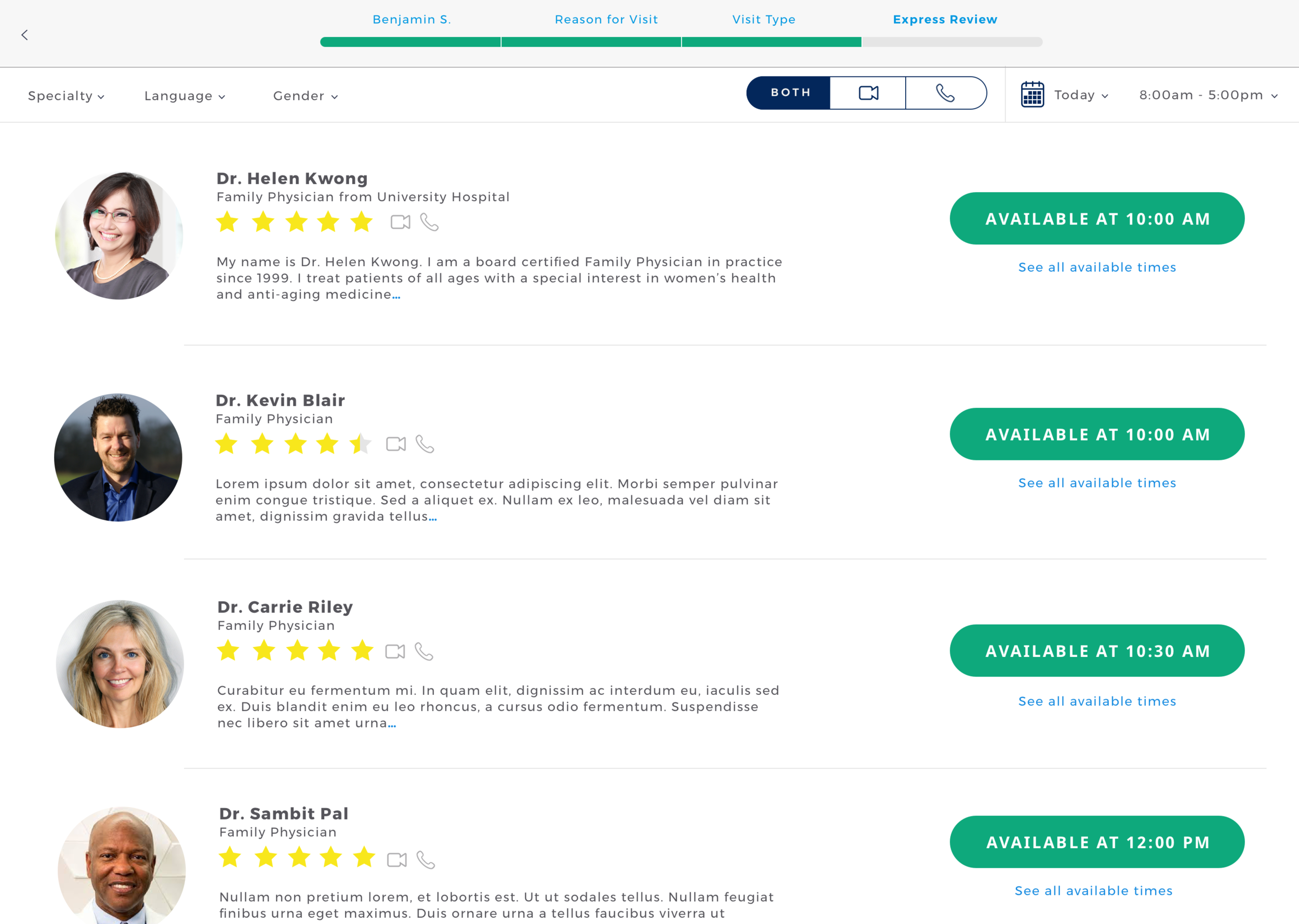
Express Scheduling
Don’t make me repeat!

42% of the visits are by returning users.
The existing scheduling process was 8 steps long and average time spent by a user was 4 minutes.
For returning users most of these 8 steps are just confirming information. We introduced a feature that skipped all the repeating stages and allowed the users review and confirm them in a single page view.
The expected outcome was to cut down the scheduling time by half.

VISUAL DESIGN
The visual design reflected company’s vision to provide users with
Efficient and convenient experiences.
A devotion to excellence in patient care.
Colors
No Red please!
Red and white are used to denote medical and emergency services. It is also perceived as warning or danger.

“Very red! Personally I always think of red as a critical, danger color. It’s not what I would have picked - would have went with something soothing.”
Ensuring colors were ADA Compliant


Typography

FINAL DESIGNS
Usability Testing
Test and iterate.
Unmoderated usability testing allows you to quickly test a larger sample of users.
I ran a series of usability tests through usertesting.com gathering qualitative feedback and iterating our final designs before starting development.
After the code was live on a staging environment, I reran some tests before the final release.

THE IMPACT
NPS increased from 53% to 74%
Average time to schedule a visit went down 25%
Net Promoter Score (NPS)
Avg task time to schedule (returning user)
Decrease in consultation failures from 6.6% to 2.8%
Decrease in eligibility failures 48.6% to 13.0%
Visit Request by Source
“The site was very straight-forward and easy to use.”
“The experience was awesome as compared to other sites I have used. I really liked that this was different and simple/fast to understand and get through”
REFLECTION
Positive results and much more to do
The redesign of the patient portal has had a positive impact on the patient experience. However, scheduling time has not been significantly decreased which means there is still work to be done to help users in distress see a doctor at the earliest possible time.
Illustration credits: Paola Gutierrez
To comply with my non-disclosure agreement, I have omitted and obfuscated confidential information in this case study.